


Iteration is one of the most significant tools a designer has to achieve the right design solution. The character sheet has undergone more iterations than any single element in the whole game. In the diagram above I show 8 iterations of just the Strength attribute and an equip square from the character sheet, yet the character sheet as a whole as undergone even more. I’ve gone through the alphabet almost twice while naming each version: version-a, version-b, etc. etc.
There were two primary factors driving this:
- How do we track attribute values on the character sheet (without pen and paper)?
- What is the right aesthetic that fits our theme?
Below, I briefly explain the thinking behind each iteration shown above.
- Hand drawn (copic), then scanned. Size is ¾ × ¾ inch. Equipment tiles at the time were the same size. I am think of using a D6 to track each attribute from values 1-6, then another custom D6 from values 7-12. No math has been done to determine if this will scale. Can a player earn an attribute higher than 12?
- The previous aesthetic seemed too rough. Changed to a smoother, digitally painted look. After a print test, it was evident that ¾ × ¾ inch was too small for equipment, so the size of all squares were increased to 1×1 inches.
- Added some color to equip squares. We did some preliminary calculations and realized that 2 dice will not be enough, maybe not even 4 dice will be enough. With the number of attributes needed to track, we were looking at close to 500 dice to be included in each box!
- Previous designs were still too plain. Switched to bitmapped graphic design / art. Aesthetic is closer to what we want, but ultimately was too gritty. We’re thinking about using numbered tiles instead of dice.
- Changed equip squares to be inset to signal to players that things go in or on these squares.
- An outlier: changed to full vector art (so we can scale the art to any size as needed) and explored a completely different aesthetic. My 6 year old daughter loved this the most, but ultimately, this was not the aesthetic we were going for.
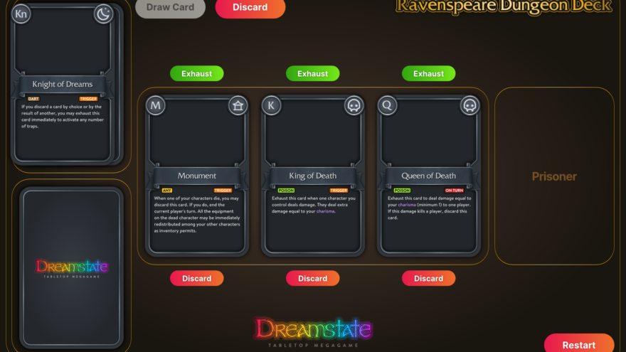
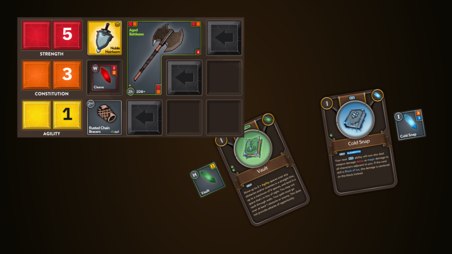
- Arriving at the right middle ground in terms of aesthetic. It’s still clean, vector art, but doesn’t look like you will use your strength to bake cup cakes. Switched to a rectangle to accommodate two dice at once so players can simply read the actual values without having to do a calculation in their heads. (I will write a future post on our dice solution.)
- Squares are featured prominently and the rectangle felt like it broke this continuity. Switched to two squares, side-by-side.